
The Art of Visual Comfort
For years, I mounted my 8×10 and 8×12 photographic prints in 11×14 acid-free mattes. It was a practical choice: standard sizing, lower material costs, and a professional presentation that helped keep my matted prints affordable.
Then I began paying more attention to the Fibonacci sequence and the Golden Ratio—not as a rigid mathematical rule, but as a guide to proportion and visual balance.
That changed the way I looked at matting.
By moving an 8×12 photograph from an 11×14 matte to a 12×16 matte, the image gains more breathing room. The larger border creates greater separation between the photograph and the frame, allowing the eye to focus on the artwork without immediately running into another hard edge.
This added space is often referred to as negative space, but it is far from empty. It helps organize what we see. The photograph becomes the focal point, the matte provides a visual pause, and the frame becomes a boundary rather than a competing element.
The result can feel calmer, more balanced and easier on the eye.
For landscape photography, this can be especially effective. Landscapes are often about atmosphere, distance and a sense of place. A more generous matte allows those qualities to continue beyond the edge of the photograph, giving the image a greater sense of openness.
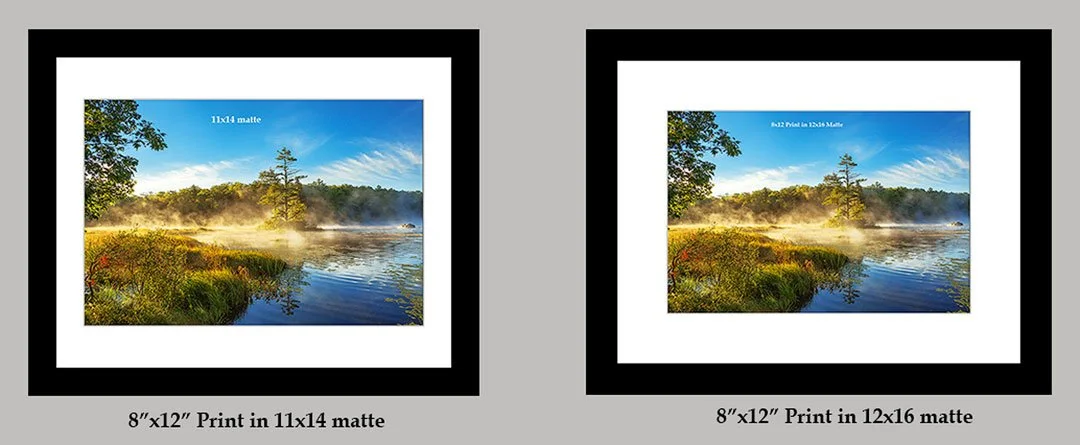
The two accompanying examples of my 8×12 photograph, Autumn Smoke, demonstrate the difference. One is presented in my traditional 11×14 matte and the other in a 12×16 matte. Both use a black frame, and the photograph itself is identical.
Yet the viewing experience is noticeably different.
The 11×14 version is compact, attractive and economical. The 12×16 presentation feels quieter and more spacious. To my eye, the frame recedes and the photograph receives more attention.
My original 11×14 format still serves an important purpose, particularly when affordability is the priority. But the larger 12×16 presentation has taught me that matting is more than a way to hold a print inside a frame.
It is part of the artwork’s visual experience.
Sometimes giving an image just a little more space can make it considerably more comfortable to view.
I think this length is better suited to a website blog because the side-by-side Autumn Smoke comparison will do much of the explaining visually.